Why Designers Use Thick Edges Only on Kitchen Islands
If you've spent any time looking at professionally designed kitchens, you've probably noticed a recurring pattern — the kitchen island has a dramatically thick, substantial countertop edge while the surrounding perimeter counters use a thinner, more understated profile. It's not a coincidence, and it's not a budget decision. It's intentional design logic, and once you understand it, you'll see it everywhere.
Here's why designers consistently apply thick countertop edges to islands — and almost never to perimeter counters.
The Island Is a Focal Point. The Perimeter Is Background.
The most fundamental principle of kitchen design is visual hierarchy — the idea that some elements in the space should command attention while others recede and support.
In most kitchen layouts, the island is the hero. It's the piece that anchors the room, defines the layout, and draws the eye when you walk in. It's visible from multiple angles — from the kitchen itself, from adjacent living and dining areas, and often from the front door.
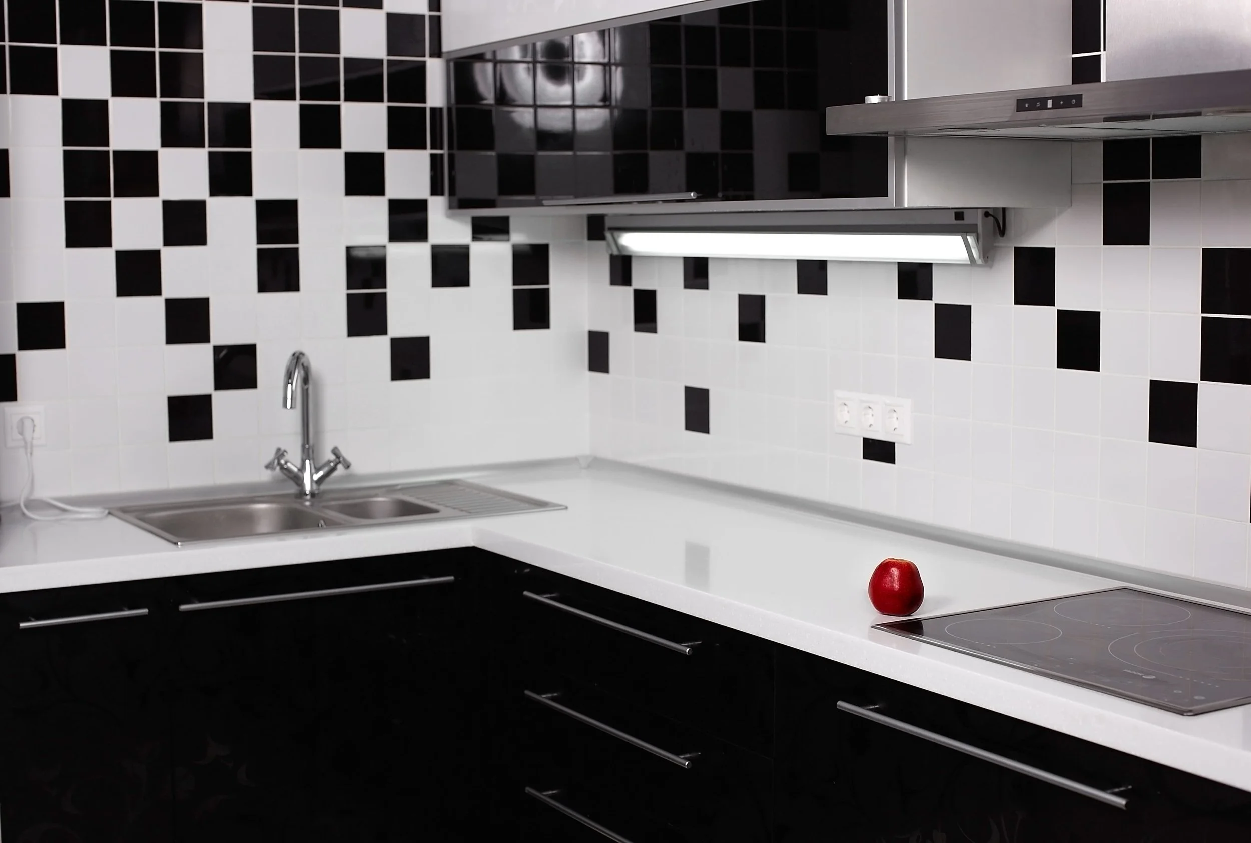
The perimeter counters, by contrast, are background elements. They run along the walls, get partially obscured by appliances and upper cabinets, and are viewed primarily from above rather than from the side.
A thick countertop edge is a side profile detail. It's designed to be seen from across the room, from a seated position at the island, from the living room looking in. Applied to a perimeter counter tucked against a wall, that dramatic thick edge is simply invisible — a significant investment with zero visual return.
On an island, it becomes a design statement that reads from across the room.
Thick Edges Add Visual Weight — In the Right Places
In design, visual weight refers to how substantial and grounded an element feels in a space.
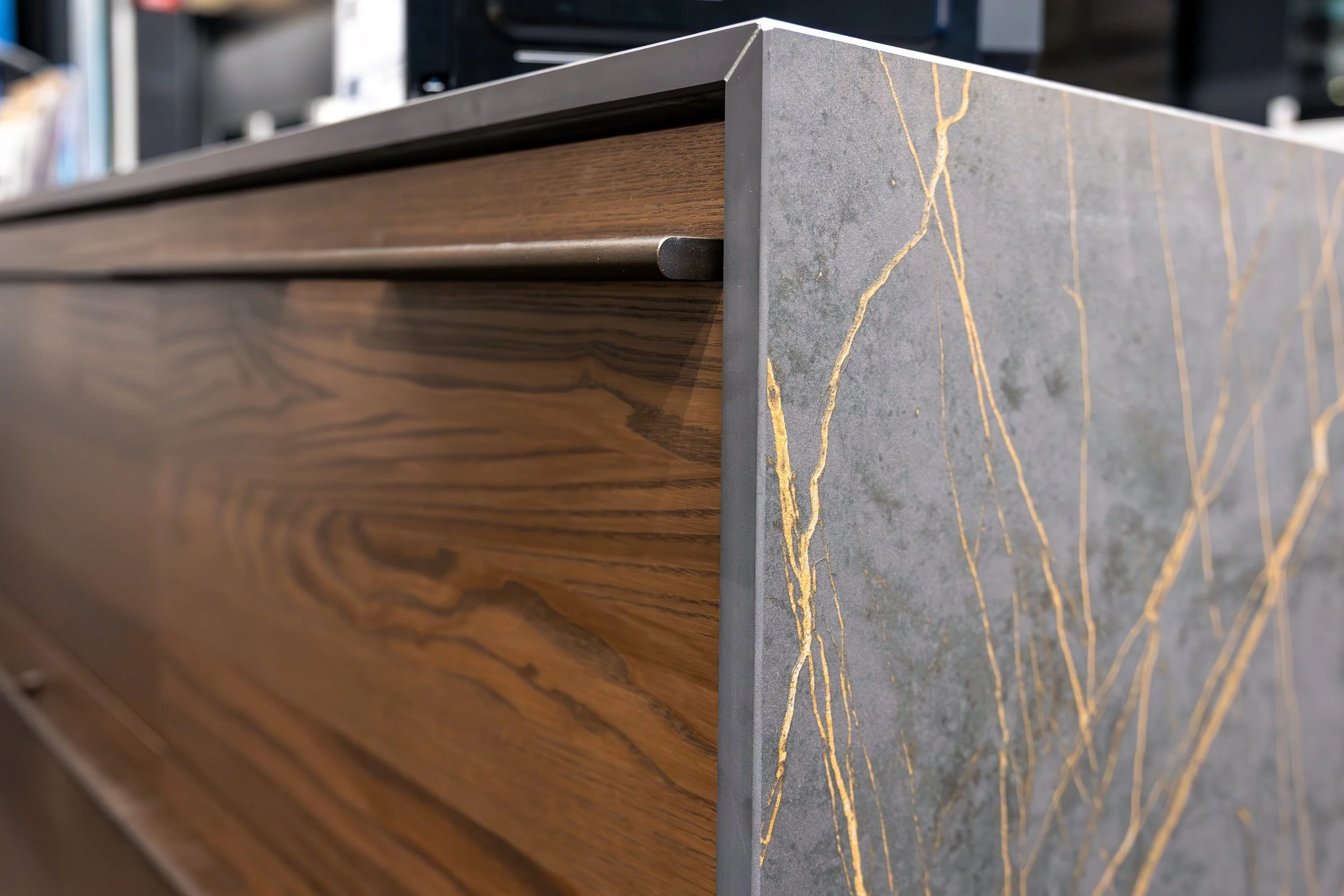
Heavy, thick elements feel anchored and permanent. Thin, light elements feel delicate and refined. A thick countertop edge — whether it's a mitered edge that creates the illusion of a four or five inch slab, a waterfall detail, or a double-stacked profile — gives the island genuine visual weight that makes it feel like a piece of furniture rather than a built-in afterthought.
This weight is intentional and desirable on an island. It signals quality. It commands presence. It makes the island feel like the intentional centerpiece it's meant to be.
Applied uniformly to every counter in the kitchen, that same visual weight becomes overwhelming — the room starts to feel heavy and crowded, with no place for the eye to rest.
The Most Popular Thick Edge Profiles and What They Communicate
Not all thick edges are created equal. Different profiles convey very different design personalities:
Mitered Edge The mitered edge is achieved by joining two pieces of stone at a 45-degree angle to create the appearance of a dramatically thick slab — typically three to five inches — while using considerably less material than a solid thick slab would require. It reads as ultra-contemporary and architectural. Clean, sharp, and intentional.
Waterfall Edge Technically a design treatment rather than just an edge profile, the waterfall extends the countertop material vertically down the sides of the island to the floor. It's the most dramatic option available and transforms the island into a sculptural element. Best suited to bold, statement stones with strong veining or movement.
Eased Thick Edge A simple, flat-faced thick edge with slightly softened corners. More approachable than a sharp miter, but still substantial and modern. Works across contemporary and transitional kitchen styles.
Ogee or Layered Profile A traditional thick edge with decorative routing — ornate, classical, and distinctly formal. Best suited to traditional or transitional kitchens where the island is meant to feel like a piece of antique furniture.
Practical Considerations for Thick Island Edges
Beyond aesthetics, there are a few practical points worth understanding before committing to a thick edge profile.
Material cost increases with thick edge applications. Mitered edges require additional material and skilled fabrication. Waterfall treatments require significantly more stone. Budget accordingly. Stone selection matters more with thick profiles. The edge becomes a prominent display surface for the stone itself — its color, texture, and veining are all visible. Choose a stone whose character you want to show off, not one you're hiding.
Island overhang should be considered alongside edge profile. A thick edge on a minimal overhang can look disproportionate. Most designers recommend a generous overhang — typically twelve to fifteen inches on seating sides — when using thick edge profiles, so the proportions feel intentional and balanced.
Conclusion
The underlying principle is simple: differentiation creates hierarchy, and hierarchy creates beautiful spaces.
By using a thick, statement edge on the island and a refined, understated edge on perimeter counters, designers create a clear visual story — one hero element, beautifully supported by everything around it. The contrast is what makes both elements look intentional.
At East Coast Surfaces, our fabrication team works with homeowners and designers to select and execute edge profiles that elevate the entire kitchen — from the statement island to the perfectly complementary perimeter counters.
Ready to design an island that commands the room? Let's talk stone, edges, and everything in between.